

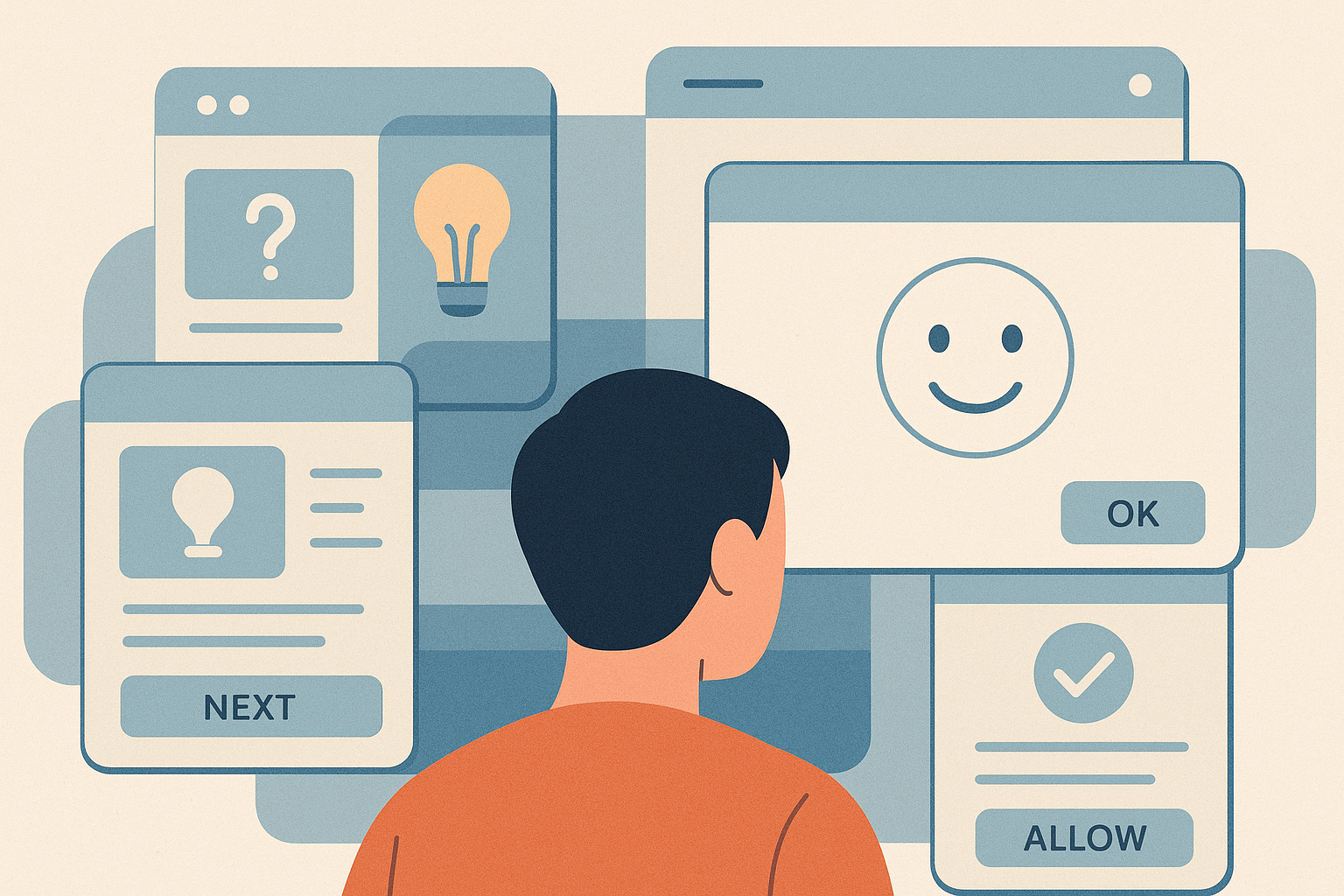
Something subtle has shifted in the way we interact with software. Apps that once felt like tools now behave more like supervisors—hovering, prodding, gently interrupting every action with an enthusiasm that quickly becomes suspicious. They offer guidance before you ask for it, warnings before you need them, and explanations you never requested. All of it wrapped in bright colors and friendly microcopy, as if modern devices were designed for people who might accidentally delete the internet if left unsupervised.
But the problem isn’t the cheerfulness. It’s what that cheerfulness conceals. Today’s apps rarely trust the user’s judgment, decisions, or ability to navigate a simple interface without being managed from start to finish. And they don’t treat people this way because users are incompetent. They do it because the business models behind them demand it. Every prompt, every nudge, every forced tutorial serves a measurable purpose somewhere inside a KPI chart. The design may appear considerate, but consideration has very little to do with it.
This is the quiet story of how software learned to underestimate its users, how UX became a mechanism of control rather than empowerment, and why so many digital products treat capable adults as if they’re one tap away from disaster. And it all begins with a simple truth the industry doesn’t like to admit: apps don’t trust you—not even with your own device.
Apps Don’t Trust You With Your Own Device
Modern apps behave like anxious supervisors convinced you’ll break something the moment they look away. Every action is prefaced with a pop-up, every choice cushioned with a “helpful tip,” every attempt to move forward greeted with a friendly but unmistakable implication: you probably don’t know what you’re doing. You tap “Skip,” and the app pretends it didn’t hear you. You dismiss onboarding, and it reappears after the next update with the persistence of an overeager intern.
This isn’t a UX accident. It’s the direct result of analytics dashboards dictating design decisions. Somewhere in a product report, someone discovered that when onboarding completion goes up by eight percent, revenue rises by four. Users who enable notifications return three times more often. People “forget” how the app works—an industry euphemism for poor design—so the product compensates with more forced explanations, more gentle warnings, more brightly colored safety rails.
The outcome is an environment where every feature is wrapped in supervision. Apps behave as if unsupervised users are a risk to the system, and the best way to mitigate that risk is to treat them like children. It’s not about helping you—it’s about controlling what you do next.
UX That Manipulates You “For Your Own Good”
For all the cheerful colors and friendly microcopy, modern interfaces often operate with the subtlety of a street magician. The trick is always the same: distract with polish, then steer the user where the business wants them to go. Buttons appear identical until one is designed to catch your eye, the preferred choice glowing in confident blue while the “No, thanks” option fades quietly into the background. Cookie banners, consent forms, subscription screens—they all follow the same choreography, nudging you toward the profitable path under the pretext of simplifying your experience.
Sometimes the manipulation is almost comical. The “Free trial—just add your credit card” button beams at you as if offering a gift. Declining it requires hunting for a pale, nearly invisible link tucked somewhere near the legal disclaimers. Want to reject tracking? Prepare to navigate a multi-step maze that looks like it was designed after a long night and several performance reviews. None of this is accidental. These patterns are not design errors—they are business models wearing a UX mask.
The underlying assumption is remarkably blunt: if the app doesn’t guide you aggressively, you won’t do what the company needs you to do. The user stops being a participant and becomes a target. Every interaction is optimized to extract something—data, attention, commitment—wrapped in the language of convenience. And as long as these tactics keep delivering measurable results, the brightly colored traps will keep multiplying, one frictionless tap at a time.
Endless Confirmations
Few rituals define modern apps as clearly as the endless cascade of confirmation dialogs. Delete a file? Confirm. Log out? Confirm. Close the window? Confirm again—this time with the button moved just far enough to make you hesitate. Interfaces behave as if every action you take is a potential catastrophe and the only thing standing between you and irreversible damage is a small rectangle begging you to reconsider.
This dramatization of basic tasks is not a reflection of user behavior; it’s a reflection of the industry’s unwillingness to build real safeguards. Rather than investing in proper versioning, undo features, or error recovery systems, teams simply place a warning screen between the user and the consequence. The assumption is that people have slippery fingers, unreliable judgment, or a permanent state of confusion—and that the safest approach is to interrupt, interrupt again, and then interrupt once more for good measure.
In reality, these dialogs exist for far simpler reasons: no one wants to pay for features that would make them unnecessary. Restoring a deleted item, rolling back a faulty action, or designing fault-tolerant workflows requires time and engineering effort. A blunt pop-up does not. And so apps lean heavily on the cheapest fix available—treating users as liabilities that must be stopped before they can do anything regrettable. The result is a digital environment where even confident decisions are greeted with suspicion, and the user learns to second-guess themselves by design.
Over-Optimistic Personalization That Backfires
Few things are as overpromised—and underdelivered—as “personalized experiences.” Apps greet you with cheerful declarations that they’ve crafted something tailor-made, only for the process to feel suspiciously generic. You select a few interests, answer a couple of questions, and suddenly the app claims to understand you better than you understand yourself. In reality, it has simply mapped you onto a segmentation model built from thousands of users who vaguely resemble your demographics. The result is personalization that feels more like guesswork wrapped in confident language.
The real purpose of these flows isn’t to understand you; it’s to route you through the path the business wants you to follow. “Tell us your goals” translates to “We need to sort you into a bucket that optimizes our funnels.” Apps ask the same questions you already answered not because they forgot, but because the product team needs fresh quarterly data to feed their dashboards. The personalization becomes intrusive, repetitive, and oddly insistent—an interrogation disguised as onboarding.
And when the algorithm tries too hard, the experience shifts from generic to unsettling. Recommendations appear that feel slightly off, eerily specific, or both. Ads adjust in ways that suggest the app is watching more closely than you’d like. The line between helpful and invasive blurs, and personalization quietly turns into a form of surveillance with better branding. What was meant to create comfort instead produces the opposite: a lingering sense that the software cares less about your preferences and more about steering you in predetermined directions.
Features You Don’t Need, Forced on You Anyway
Open almost any app today and you’ll find a quiet identity crisis unfolding. What started as a simple, functional product now behaves like it’s auditioning for a role in a larger ecosystem. A note-taking app decides it should also be your task manager, your collaboration hub, your AI writing assistant, your cloud backup service, and possibly your new social network. Features appear not because users asked for them, but because internal roadmaps must demonstrate progress—and growth teams must hit targets.
The result is an ever-expanding landscape of additions that solve imaginary problems. AI assistants materialize in apps where a search bar would suffice. Stickers appear in tools meant for professionals. Social feeds sneak into products that once prided themselves on focus. Even video calls can appear where no one expected—or wanted—them. Each new feature earns a celebratory announcement and a metric on someone’s dashboard, even as the core functionality becomes harder to locate beneath the clutter.
For users, this avalanche of “innovation” feels like cognitive overload disguised as improvement. Every added function brings new icons, new menus, and new disruptions to workflows that once felt simple. For developers, it produces layers of technical debt that will never fully be paid down. What begins as an effort to keep the product competitive ultimately leaves both sides frustrated. The product grows, but not in a direction that serves the people actually using it. Everyone loses—just at different speeds.
It’s Not Developers
When an interface feels condescending, bloated, or manipulative, the instinct is to blame the people who built it. But in reality, developers rarely choose any of this. The modern product is a negotiated artifact shaped by competing internal agendas, where each department pulls the interface toward its own priorities. Marketing wants higher conversions, product wants more engagement, designers want more control, legal wants more disclaimers, security wants more warnings, customer support wants fewer complaints, and leadership—inevitably—wants more upsells. By the time these demands reach the engineering team, the original idea of a clean, respectful user experience has already been buried under layers of KPI-driven ambition.
Developers simply implement what survives this internal war. The resulting interface reflects the incentive structure, not the craftsmanship of the team writing the code. If metrics reward aggressive onboarding, you get aggressive onboarding. If dashboards favor engagement spikes, you get nudges and reminders. If revenue depends on steering users toward subscriptions, every design choice will tilt in that direction. The product becomes a collage of subtle pressures, each traceable to a business requirement rather than a design principle.
Apps treat users like idiots not because developers think they are, but because the organization doesn’t trust users’ attention, decision-making, or willingness to pay. From the company’s perspective, the safest bet is to assume confusion, guide behavior, minimize friction in profitable areas, and maximize friction everywhere else. Intelligence—human or otherwise—is never the issue. Incentives are. And as long as those incentives remain unchanged, the interface will continue to reflect the company’s anxieties more than its respect for the people using the product.
What Good UX Actually Does
There is a version of software that doesn’t hover over your shoulder or second-guess your every move. Good UX begins with a simple assumption that has somehow become radical in modern product design: the user is intelligent. Instead of drowning people in tooltips, nudges, and permissions rituals, it quietly removes unnecessary steps. It respects your time, avoids interruptions, and refuses to weaponize your attention. It doesn’t hide critical features behind three layers of engagement-driven UI, nor does it inflate routine tasks with artificial friction designed to steer you toward a preferred outcome.
In products that genuinely trust their users, control flows both ways. You decide what notifications you want, not the product team. You choose your own path through the interface instead of being shepherded through a predetermined journey. Mistakes are treated as natural and reversible, not catastrophic events that justify a barrage of confirmation screens. Guidance exists, but only when necessary. Permissions are requested when the feature truly needs them—not as part of a data-collection choreography. Your choices remain yours.
And when an app feels effortless, it’s never because the problem was trivial. It’s because a team did the hard work long before you arrived—cleaning the architecture, simplifying flows, removing redundant checks, and making decisions that don’t show up on dashboards but do show up in user satisfaction. Good UX looks invisible from the outside, but it is anything but accidental. It is respect translated into design: calm, confident, and quietly competent.
The Takeaway: You’re Not the Problem
The irony of modern product design is that it often treats users as the weakest part of the system, when in reality the weaknesses belong to the organizations building the software. Bad UX doesn’t come from malice or incompetence; it comes from pressure. Every nagging dialog, every forced onboarding step, every manipulative color pattern is the visible output of internal metrics that value short-term wins over long-term trust. When companies optimize for KPIs instead of people, the interface inevitably begins to reflect those priorities: infantilizing, overprotective, noisy, and relentless in its attempts to guide behavior.
Users aren’t confused, fragile, or unpredictable—they’re simply navigating products that underestimate them. And while these tactics may produce incremental gains in engagement or conversion, they erode something far more important: the sense that software is a tool meant to empower, not manage. The apps that continue to treat users like liabilities will keep getting ignored, replaced, or quietly uninstalled.
The path forward isn’t complicated. Treat people like adults. Design with clarity instead of coercion. Build flows that respect autonomy, rather than defending revenue models. The companies that embrace this shift will earn loyalty without resorting to tricks, and the ones that don’t will keep wondering why their “optimized” experiences result in users slipping away. The problem has never been the intelligence of the people using the software. The problem is the incentives driving the people who build it.