
Key Takeaways
- Infographics and visuals should become key accessories of an article.
- Every marketing expert should learn the basics of data visualization. Infographics help you to explain the complexity behind some ideas and concepts.
- Learn tools and fundamentals of content marketing infographics.
If you want to learn how your marketing team can benefit from creating infographics and which charts and graphs you can create using the data visualization platform, we are here to help you.
Infographics are a part of content marketing strategy and visualization that transform complex information with figures into visual displays.
As marketers, we improve users’ understanding and interaction with content when we represent data in infographics, charts, graphs, and maps. Content marketing infographic help you build brand awareness, get more traffic on the web and improve your blog visuals. Did you know that our brain processes images 60,000 times faster than text? If you want to grab the attention of your audience and readers, you should use visual elements.
What Are Examples of Data Visualization?
If you look at the data visualization platform Live Charts that the LaSoft team developed, you can find visual templates and learn how to create digital marketing infographics for businesses. The main goal is to give your users useful information in easily understandable visual form, building their belief in your competence and ability to translate complex concepts into plain and understandable visuals. Our tips on creating infographics and using them as a part of visual content marketing strategy.
Tip #1. Data visualizations should always serve a clear purpose. When we understand the goal of visualization, whether as the creator or the viewer, we can better evaluate if it effectively shows us the outcomes.
Example of the Bar Chart: One of the most common purposes of visualization is to compare different data groups, such as tech talent shortages across various countries. Well-chosen axes, axis limits, labels, and symbols can greatly enhance the ability to identify patterns in the data. We recommend using a horizontal Bar Chart if you have more than 7 points of data. In this case, your visualization will look good on mobile devices.
Talent Shortages Around The Globe,%
Tip #2. When visualizing data, displaying them horizontally sorted from top to bottom (highest to lowest) is generally more intuitive than using vertical bars from left to right. However, a common exception is when the data is time-based, as time is typically visualized from left to right, representing the flow from past to future. In this case, presenting data in a Column Chart is better.
Metaverse Health And Fitness Market Size
Tip #3. A Pie Chart is a data visualization tool that shows the proportional relationship between different categories within a dataset. It represents the data as slices of a circle (the pie), where each slice’s size is proportional to the value it represents in relation to the total. The whole pie represents 100%, and each slice represents a fraction or percentage of that whole.
Pie Charts are useful for:
Visualizing proportions: Displaying how much each part contributes to a whole.
Comparing categories: Highlighting the distribution or breakdown of categories in a dataset.
Showing percentages: Making it easy to understand the relative size of each category.
- 20000
- #C58C00
- 7580
- #E6A521
- 5000
- #F4C145
- 3550
- #F6D173
- 1030
- #F9E0A2
Tip #4. Use a Donut Chart for your content to display parts of a whole, similar to a pie chart, but with added flexibility. The center of a donut chart can hold a label or percentage to highlight a key metric, making it ideal for emphasizing specific values within a dataset. It works best for data with limited categories and is effective when you want to provide a quick overview while allowing space for a central data point or summary.
- 1400
- #C58C00
- 1050
- #E6A521
- 400
- #F4C145
- 400
- #F6D173
- 320
- #F9E0A2
Tip #5. Use a Line Chart to show trends. This type of chart connects individual data points with lines, making it easy to identify upward, downward, or stable trends. Line Charts will help you show website traffic, revenue growth, or user engagement over a certain period. You can also plot multiple lines on the same chart to compare trends between two or more data sets. For example, in a blog post about business growth, you could use a line chart to show monthly revenue from the past two years, highlighting growth or decline periods.
- PL
- 2000,2500,3300,3100,4200,3800
- #C5C7CB
- DK
- 3000,2900,4000,4500,5500,5900
- #F0B528
- LU
- 2600,3200,3100,4000,5000,5000
- #565358
Tip #6. An Area Chart shows the magnitude and changes of values over a continuous range, such as time, distance, or another measurable parameter. It visually represents the relationship between different data sets and highlights cumulative values, overlaps, and trends.
It best highlights the proportion of multiple components related to the whole (e.g., revenue breakdown by source over time). For better context and insight, you can also visually compare data changes, such as growth rates or fluctuations, and show cumulative data, such as total revenue, energy consumption, or overlapping trends.
People can use visual data in their daily lives. Whether working on a personal project, tracking fitness goals, analyzing personal data, or surfing social platforms, you benefit from the visual presentation of complex data.
Interactive visualization is a great tool for anyone who wants to deepen their understanding of a context. It’s also invaluable for content marketing efforts to reach out to the target audience through blog posts, email marketing, SMM posts, and presentations.
Key Principles of Effective Infographic Marketing Strategy
Effective data visualization, such as infographics, is not only about making nice charts and graphs. You need to follow essential rules to make the most of data. These rules help ensure that information is clear, correct, and helpful for those viewing it.
NOTE! The human brain processes visual messages an astounding 60,000 times faster than text, making infographics a rapidly popular choice for presenting complex data in an easily digestible format.
When data scientists focus on effective visualization rules during the design process, they can create stunning visualizations that look good and convey complex information to the target audience. This leads to a better understanding of the data displayed and helps your potential clients trust your information and make smarter choices.
Infographic Tools Help With Brand Exposure
How do infographics significantly boost brand awareness by aligning graphics with your branding and adding your logo?
- In fact, using a company’s colors increases brand recognition by 80%;
- Research shows that incorporating infographics into your digital marketing can increase website traffic by at least up to 12%;
- Consumers are willing to pay for products from brands they trust as accurate and valuable information through infographics helps establish your credibility, positioning you as an expert in your field;
Brands that use infographics in their marketing efforts stay competitive and engage with the audience effectively.
How Live Charts by LaSoft Can Boost Interaction With Your Website Content And Blog
Our research has shown that static content is often not enough to hold users’ attention or encourage them to interact with the data. While text and images are essential components of digital content, they don’t always provide the dynamic interaction that modern users expect. We discovered that interaction rates skyrocketed when we incorporated interactive charts and graphs into our website content. Users weren’t just passively reading along; they were actively engaging, exploring data, and interacting with different categories and figures.
Interactive data visualization provides a more immersive experience that allows users to play with information, explore details, and understand complex data in a way that static charts simply can’t provide. This level of interaction leads to a deeper understanding of the content, making users more willing to spend time on the page and share it with others.
Our team created Live Charts, a solution intended to bring any content to a final user in the most engaging way, according to our research findings and user feedback. Live Charts allows you to create engaging, dynamic visuals easily integrated into any website, blog post, or online article. Our tool offers a variety of customization options, so you can tailor the charts to fit the specific needs of your content. Whether you’re highlighting trends, comparing data sets, or breaking down complex information into digestible visuals, Live Charts can transform how your audience experiences your content.
Illia Tretnikov, a Senior Product Designer at LaSoft, states that the motivation behind his team’s work on Live Charts was to develop a more engaging way for people to interact with data.
“Our research inspired us by the idea that information shouldn’t just be presented; it should be experienced. During the development process, we focused on making the charts as intuitive and interactive as possible, allowing users to explore data in a natural and fun way. Our goal was to turn complex information into dynamic visuals that inform and captivate, and I’m proud of how the team came together to bring this vision to life.”

Live Charts’ Contribution to Interaction With Your Users
Enhanced User Experience: Interactive charts make the data exploration process enjoyable and intuitive. The more engaging the experience, the more likely users will stay on the website and push CTA.
Data-Driven Storytelling: Live Charts allow us to tell a story with data, guiding users through the information in a structured way. This helps digest complex data more relatably and easily.
Versatility: Our tool can be used in various content formats, including blog posts, news articles, marketing materials, and more. Live Charts provide a versatile way to present data-driven insights regardless of industry or audience.
Increased Sharing and SEO Benefits: It’s a good chance for your content to engage users and encourage them to share it more widely on social media. This broadens your audience and improves your SEO, as search engines prioritize content that keeps users engaged.
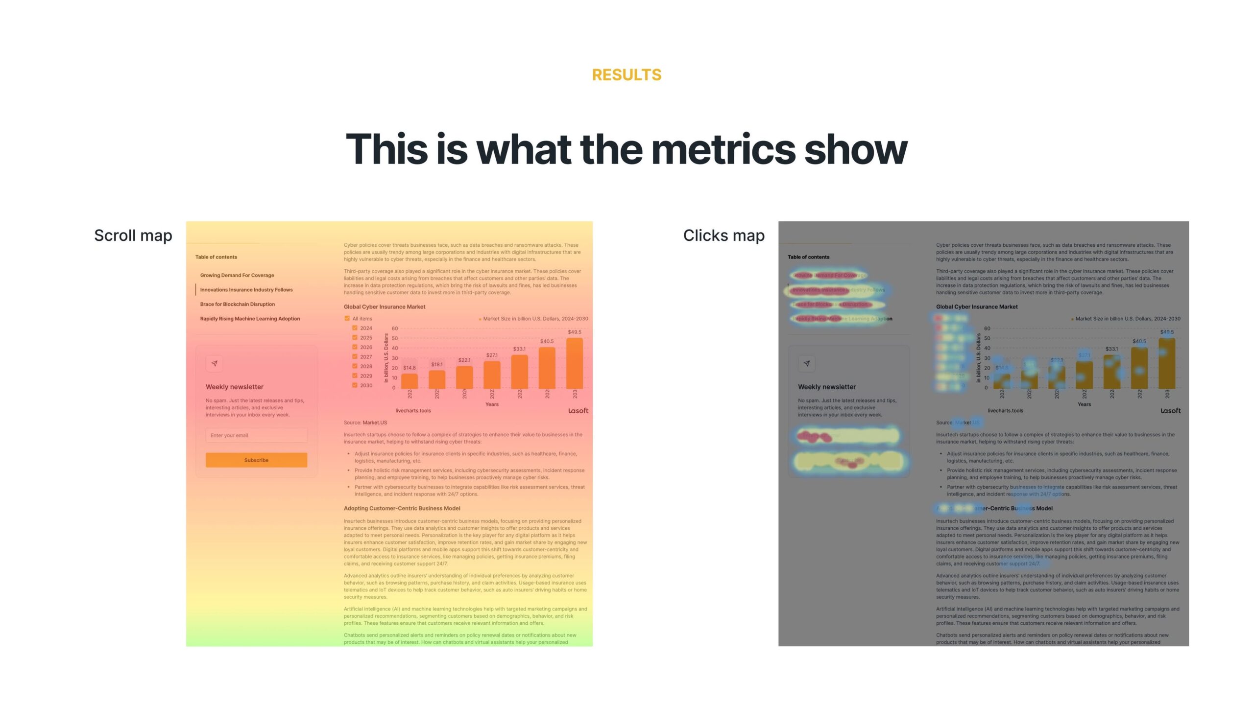
The image below represents a scroll map and clicks map. As you can see, blog readers stop their attention on Charts and Data (the reddest area of the scroll map), and when they have an option, they click and play with visual data.
Best Practices for Content Marketing Infographics
Picking the right type of visualization is very important. It should match your data and the story you wish to tell. A simple and clear message is a key. Try to avoid clutter and extra visual elements. This can make your visualization more effective.
Design With the Audience in Mind
Effective data visualization starts with knowing your audience. Before you begin designing, think about how well they understand the data, what interests them, and what information they need. A chart for data scientists will look very different from one made for the general public.
Keep user experience as your main focus during the design process. Choose clear layouts, simple labels, and add interactive features when it makes sense. A messy or unclear visualization will make it hard to understand and go against the purpose of data visualization.
Simplify Complex Information without Losing Essence
Infographic visualization takes complicated data sets and presents them in a simpler way. However, this simplification should not lose accuracy or important details. It is vital to find the right balance between being simple and being complete for effective presentation.
Overcoming Information Overload
In today’s world, there is a lot of information everywhere, which can make it hard to create clear data visuals. With so much data out there, people often try to show too much at once, which can make the visuals messy and hard to understand.
Good data management helps fight against this overload. You need to pick the most important data points and remove extras that don’t help get your message across. By focusing just on the key information, you can make the most sense out of visuals.
Ensuring Accuracy and Integrity of Visual Data
Maintaining accurate and honest data is vital. A nice-looking visualization does not matter if it shows the data wrongly. Always check your data sources. Make sure they are clean. Use the right scales and axes to keep your work trustworthy and prevent confusion.
Final Insights
Content marketing infographics for business means changing complex data sets into simple, clear infographics like charts, graphs, and maps. This helps us see patterns, understand information better, and share it clearly. In areas like marketing, website content, and blogs. Using the right data visualization platform is changing how you present information to your potential clients, elevating their interaction with your digital product, and building their loyalty to your brand and trust in your expertise.

